// Portfolio03 UI/UX Design
HMI dashboard
Designed a user-friendly, visually clear automotive HMI dashboard that prioritises key driving information and driver safety.
- Discipline
- UI/UX Design
- Category
- Automotive
- Role
- UI/UX Designer
- Tools
- Figma
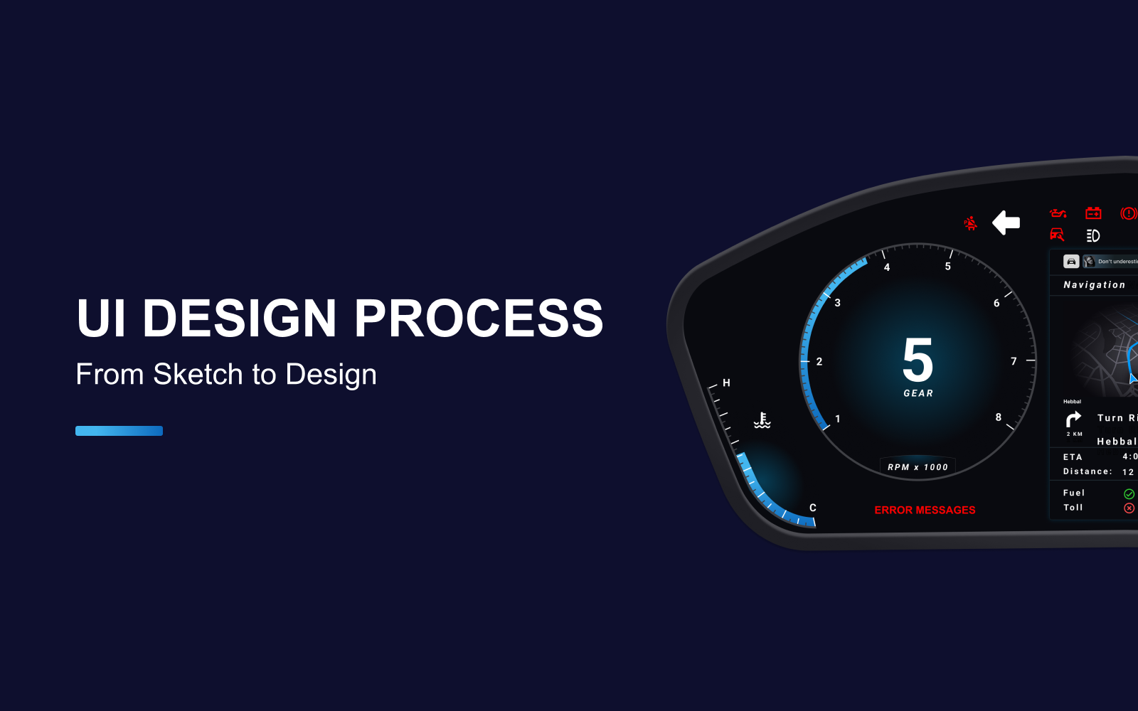
Overview
This project focuses on designing a Human Machine Interface (HMI) system for automotive dashboards. In modern vehicles, the HMI acts as the main communication bridge between the car and the driver, making it essential that the interface is clear, efficient, and user-friendly. The design ensures that key driving information such as speed, odometer, fuel level, and warnings are displayed prominently while maintaining a clean and minimal layout.
The approach taken was not only to create a functional display, but also to make it visually appealing and safe to use while driving. Before starting the design process, research was conducted to understand drivers needs what information they prioritize, how quickly they expect to access it, and which modes of interaction they find most convenient.
UI UX Design Process for Creation of HMI's
// How I Worked
- 01
Sketches
Rough hand-drawn cluster layouts, exploring where speed, fuel and alerts sit so the eye finds them fast.
- 02
Wireframes
Layout concepts and screen flows: how the driver moves between drive, navigation and media views.
- 03
Design mock-ups
The wireframes built into high-definition screens, with a consistent colour code for routine, warning and critical states.
- 04
Final design
Final screens presented for sign-off, with icons, specs and assets handed over to the development team.
However, there are several aspects that need to be considered and agreed upon before the HMI design process can begin:
Process values and labels – Understanding which process values are most important guides how information should be presented on screen. This determines which readings draw the eye, what level of detail (e.g., decimal points, measurement units) is shown, and how alerts are prioritized. It is also essential to identify which information is routine and which requires immediate attention, ensuring the interface communicates clearly under all conditions.
Navigation – Most HMI systems involve multiple display screens. Defining how users move between these screens is crucial whether through buttons, menus, or other methods. The navigation structure should minimize the number of steps required to reach key functions, while also considering the environment of use (for example, touchscreens may be less effective in areas with dust, oil, or moisture).
Color – While colors enhance the visual appeal of an HMI, their primary role is functional. They must be used consistently to indicate commands, states, and alerts. High-contrast combinations (such as light text on dark backgrounds) are preferred for readability. Critical alerts should be standardized in their color use, making them instantly recognizable to operators.
Layout – The arrangement of information on each screen should reflect the way the system is actually used. A logical, uncluttered layout makes navigation intuitive and prevents errors in operation. Grouping related elements together and reducing unnecessary content ensures that the user can interact with the system quickly and accurately.
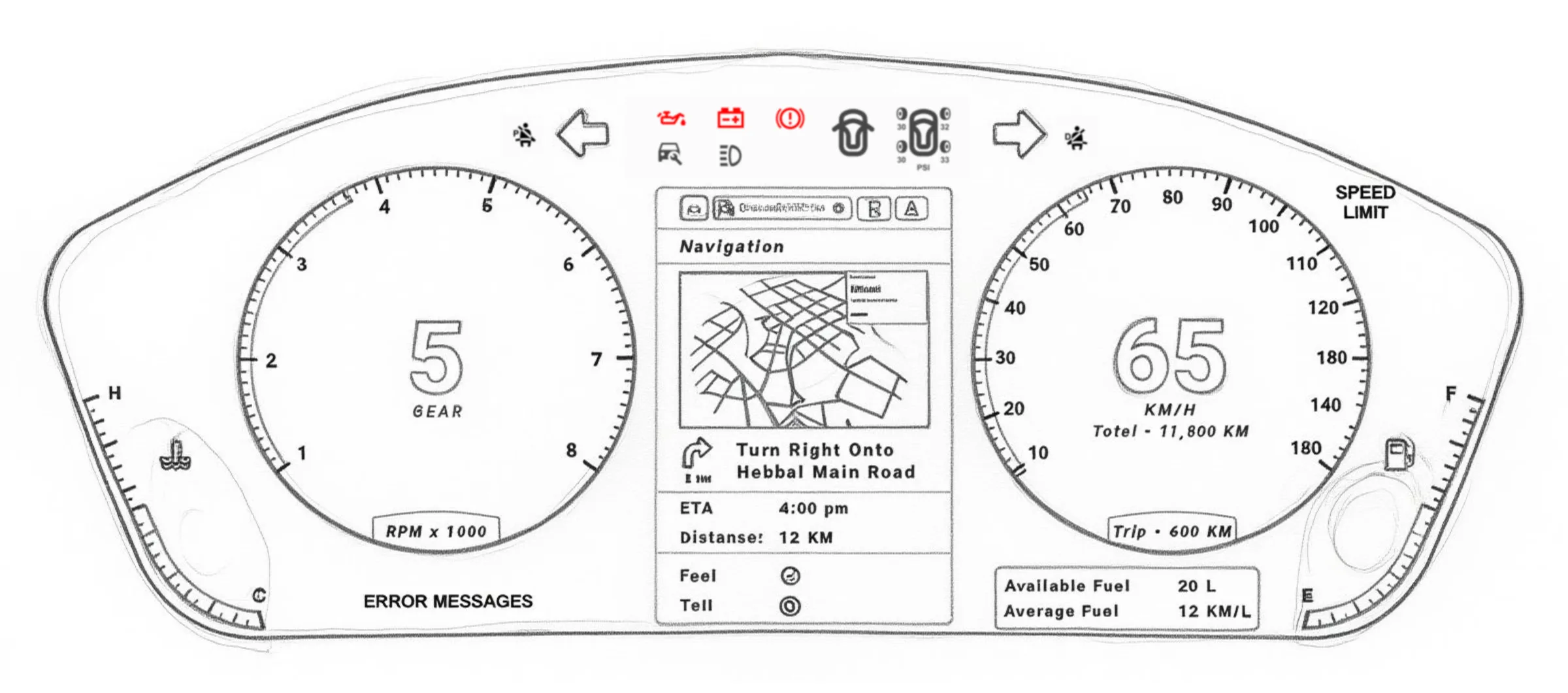
Sketches – Once the requirements are clear, rough sketches and hand-drawn concepts are created to visualize the interface. These sketches provide an early representation of the layout, navigation flow, and key elements. After review and refinement, the approved concepts are translated into UI design software, where they evolve into detailed digital prototypes.
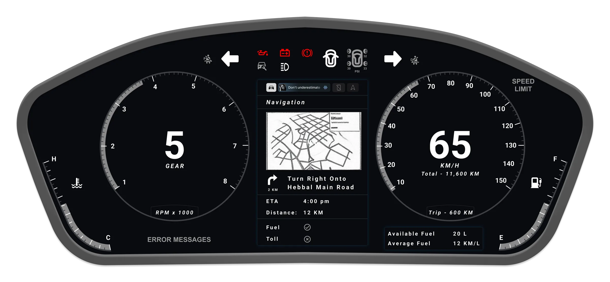
Wireframes – Once the requirements are clear, rough sketches and hand-drawn concepts are created to visualize the interface. These sketches provide an early representation of the layout, navigation flow, and key elements. After review and refinement, the approved concepts are translated into UI design software, where they evolve into detailed digital prototypes.
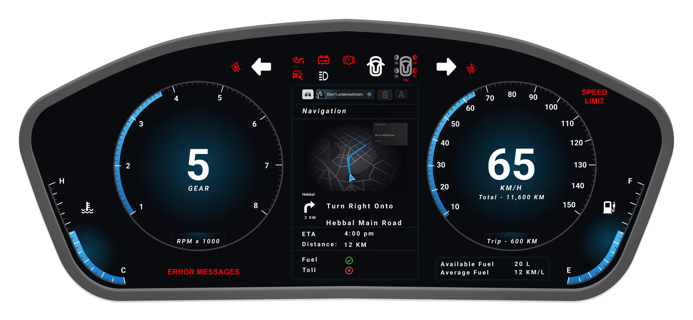
High-Fidelity Design – Building upon the wireframes, high-definition mock-ups are created to explore visual styles, color schemes, and layout refinements. These designs showcase how on-screen controls, indicators, and navigation will appear in a real environment.
At this stage, technical constraints are reviewed with the engineering perspective in mind, ensuring that the designs are not only visually appealing but also feasible for implementation. The final version of the HMI interface is then consolidated and handed over for development, representing a complete and functional design system ready for production.
What I did
- Designed a modern digital dashboard focused on clarity and safety
- Brought speed, fuel and driver alerts into one clean interface
- Used user research to guide ergonomic and usability improvements
- Delivered a sleek, distraction-free driving experience
Like what you see?
Let's talk about the role or project — I reply within 24 hours.