// Portfolio04 UI/UX Design
tripora
A smart travel assistant for Indian travellers — inspiration, planning and booking in one app instead of five.
- Discipline
- UI/UX Design
- Category
- Travel
- Role
- UI/UX Designer — end-to-end
- Tools
- Figma, User research, Prototyping
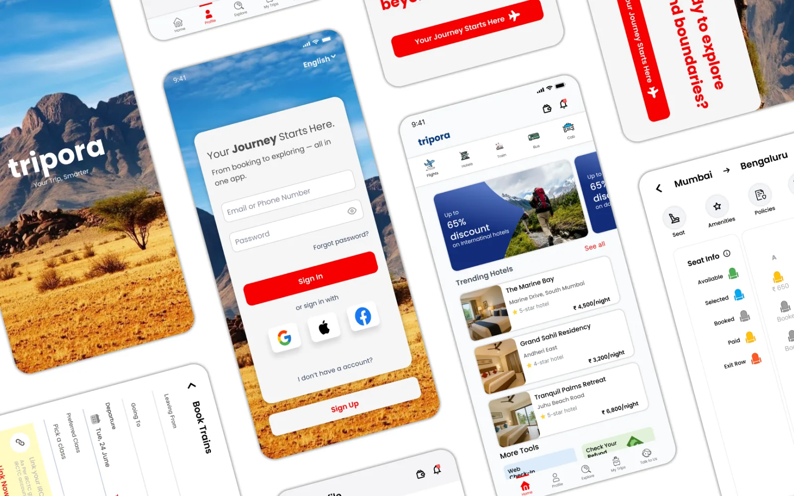
Overview
Travel is meant to be exciting. Planning one usually isn't. You open a flight app, then a hotel app, then maps, then reviews, then a spreadsheet to hold it together — and by the time the trip is booked you are tired of it.
tripora is a smart travel assistant for Indian travellers. It curates trips around preferences, budget, lifestyle and trip goals, and carries a user from the first idea through to the booking confirmation without leaving the app.
This was my second self-directed project, and I took the full UX cycle: framing the problem space, research, personas and flows, then wireframes, UI and usability testing on a clickable prototype.
// How I worked
- 01
Research
Surveys and interviews with travellers aged 20 to 70, plus a review of Indian travel apps and where they are heading.
- 02
Define
Pain points, personas, a customer journey map and How Might We questions.
- 03
Structure
User flows for registration, home and booking, and the information architecture behind them.
- 04
Design and test
Low-fidelity wireframes and a style guide, built into high-fidelity screens and a clickable prototype tested across age groups.
Why travel planning
I picked this because I have lived it — hopping between sites and apps to assemble one trip. I wanted to see what happens when the whole process is centralised and made personal, so that preparing for a journey is something you enjoy rather than endure.
Two decisions shaped everything, and both came out of the research.
Personalisation – Every traveller is different: solo, family, tight budget, experience-hungry. Most apps offer one-size-fits-all. I designed for relevance over randomness.
An end-to-end experience – Not just booking, but inspiration, planning, booking and organising in one place — less friction, less time, more enjoyment.
Who it is for
Professionals, families and retired travellers aged 20 to 70, in Tier 1 and Tier 2 Indian cities. People who love travelling but struggle with the planning: too little time, too little personalisation, decision fatigue, and too many disconnected tools.
Designing for a range that wide mattered. A 26-year-old booking a solo weekend and a 65-year-old booking a family holiday do not read a screen the same way.
Starting from nothing
There was no existing app or flow to improve, so everything had to be defined: the feature set, the user flows, the information architecture and the UI. That freedom came with a risk — without a tight problem definition, a blank page turns into feature soup. So I fixed the goal early: a smart assistant that supports a traveller from inspiration to execution, and earns its place by being personal and easy rather than by having more options than the competition.
Research
Primary research – Surveys and interviews with travellers aged 20 to 70 across Tier 1 and Tier 2 cities — solo, family and group — to understand how they plan, what frustrates them and what they wish existed.
Secondary research – Travel apps are moving toward AI-assisted planning and conversational assistants, while the leading Indian travel agencies compete on multimodal booking (flights, trains, buses, hotels) and are edging into integrated trip planning.
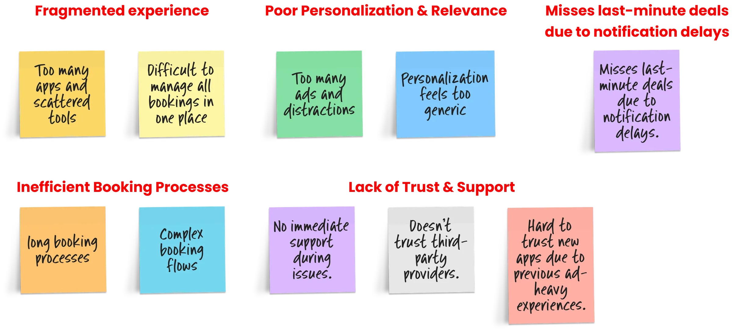
What came back from the interviews: heavy reliance on several apps at once, long booking flows that make people give up, generic personalisation that buries relevant deals, distrust of ad-heavy interfaces and unclear third-party policies, and real difficulty managing bookings in one place when plans change at the last minute.
What travellers told me
A fragmented experience – Planning one trip means juggling three to five apps, and the bookings end up scattered across all of them.
Slow booking – Long flows, repeated searches and verification steps make people abandon a booking halfway.
No trust, no support – Slow or absent customer support, ad-heavy screens and unclear third-party policies make people hesitate at the moment of paying.
Generic recommendations – Suggestions that ignore budget and preference, so the relevant ones get lost.
Deals that arrive too late – Notifications after the offer has gone.
// From the survey
- 76%
- switch between 3–5 apps to plan one trip
- 62%
- said booking takes too long
- 58%
- found suggestions did not match their budget or taste
- 40%
- missed deals because alerts came too late
Where existing apps fall short
No personalisation – Generic suggestions that ignore interests, travel style and budget, with nothing learning from past behaviour.
Disconnected tools – Four or five apps for flights, hotels, itineraries and activities, which is where the decision fatigue comes from.
Little user control – Rigid flows with limited room to customise a plan or switch between travel types — solo, family, budget.
Cluttered interfaces – Information hidden or piled up, which pushes away new and less tech-confident users, retirees especially.
Booking, not planning – Most apps stop at the transaction. Very few cover the journey from inspiration to execution.
Competitor analysis
MakeMyTrip – Broad inventory and huge reach, and it has launched an AI trip-planning assistant. But users report real pain with support and with managing a booking after it is made.
ixigo – An AI itinerary builder and multimodal planning tuned to how Indians actually travel. The opening is in unifying bookings and going deeper on personalisation across trips.
Airbnb – Rich experiences and a genuinely good Trips itinerary, moving toward AI-first assistance. But it is accommodation-first, not a full travel agency for Indian flights, buses and trains.
Cleartrip – Clean, minimal, fast to search and book, with frequent offers. Thin on post-booking management and personalisation, and no integrated planning.
Hypotheses going in
All-in-one planning and booking – Bringing planning and booking into one place will save time and reduce stress.
Better personalisation – Recommendations that fit the traveller will drive engagement.
Real-time support – Timely help and notifications will build trust.
Streamlined booking – Shorter booking flows will cut drop-offs.
Personas and journey
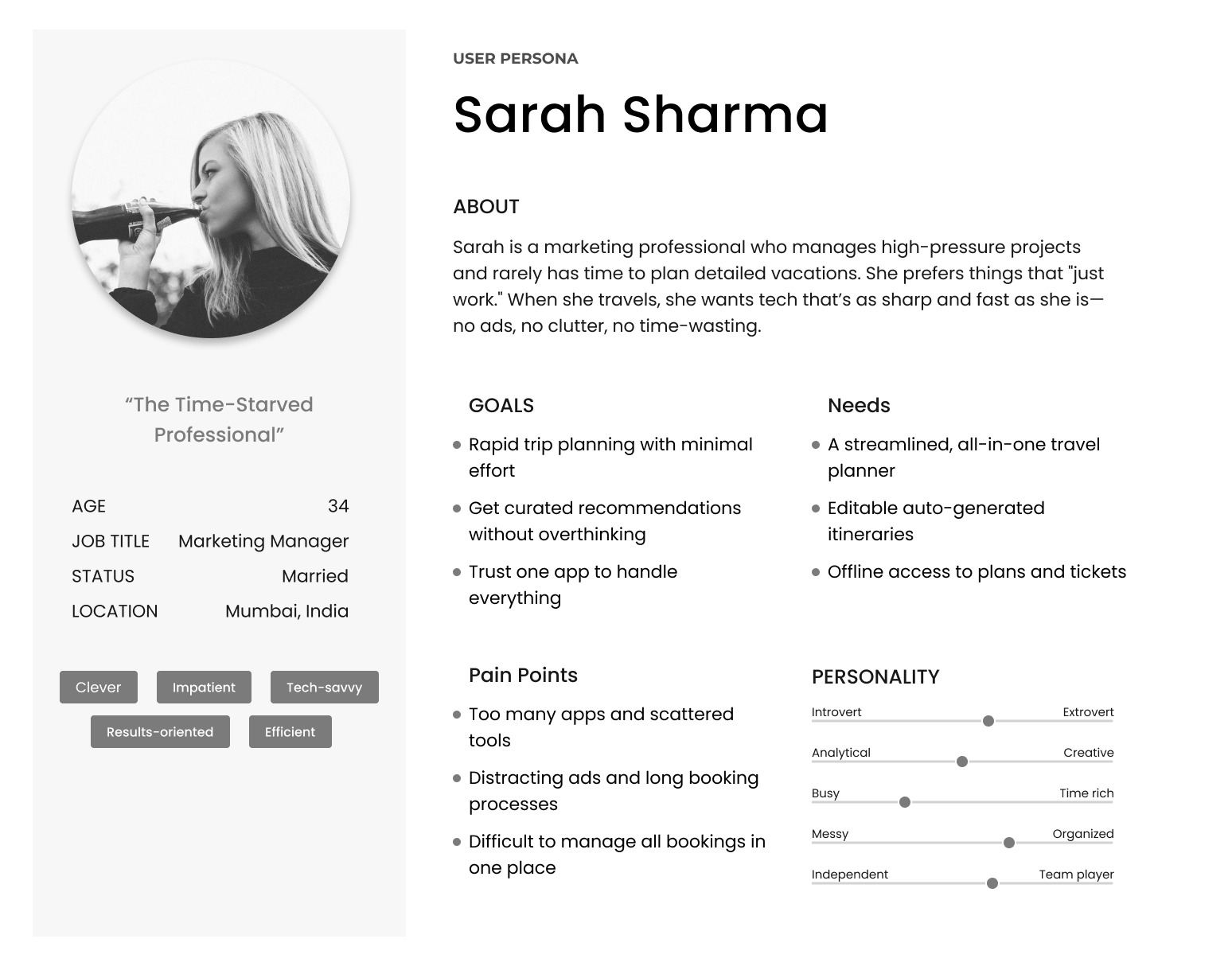
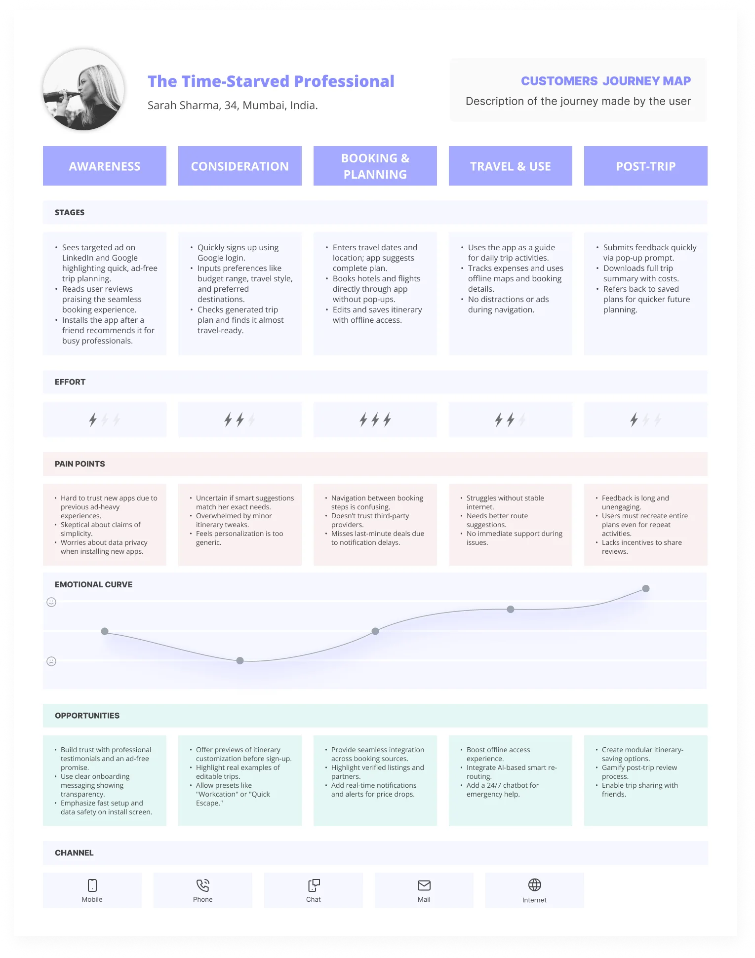
I built personas across the age range the app serves, then mapped the customer journey to find where planning breaks down: the moment a traveller leaves for a second app, and the moment a long booking flow loses them.
How might we
Each pain point became a question to design against.
Fragmented experience – How might we let travellers plan, book and manage every trip detail in one platform?
Slow booking – How might we make booking faster and simpler without taking away the options people need?
Trust and support – How might we build trust and offer help at every stage of the journey?
Personalisation – How might we give recommendations that genuinely match a traveller's preferences, budget and context?
Missed deals – How might we deliver timely, relevant alerts so nobody misses a last-minute offer?
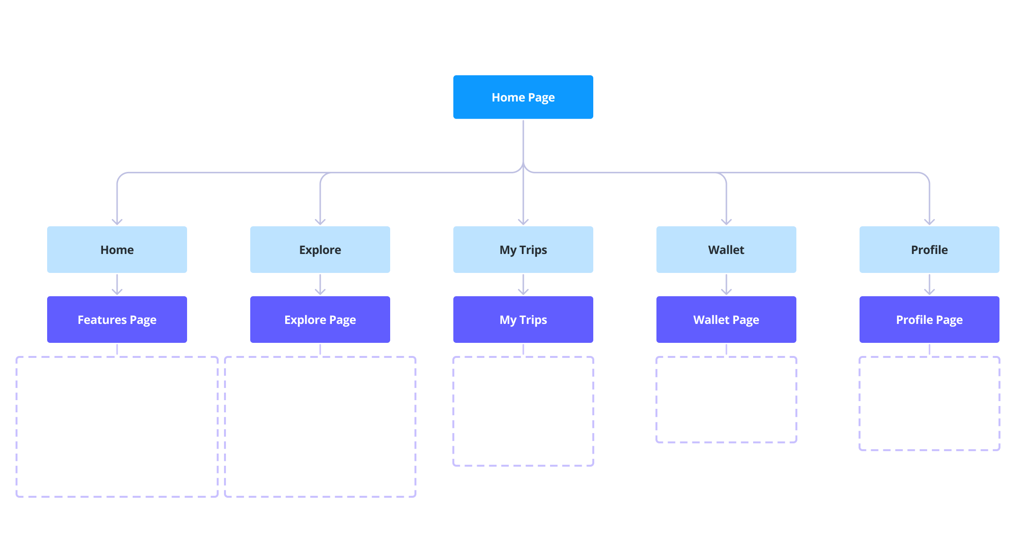
Flows and information architecture
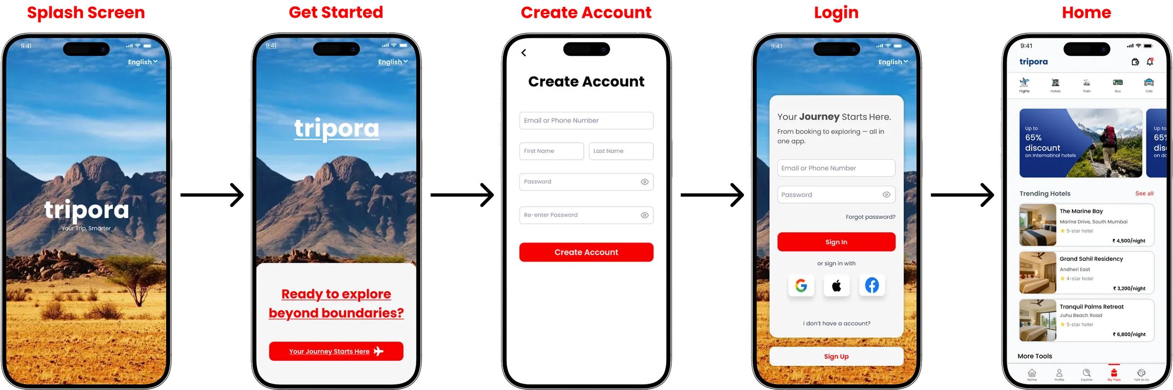
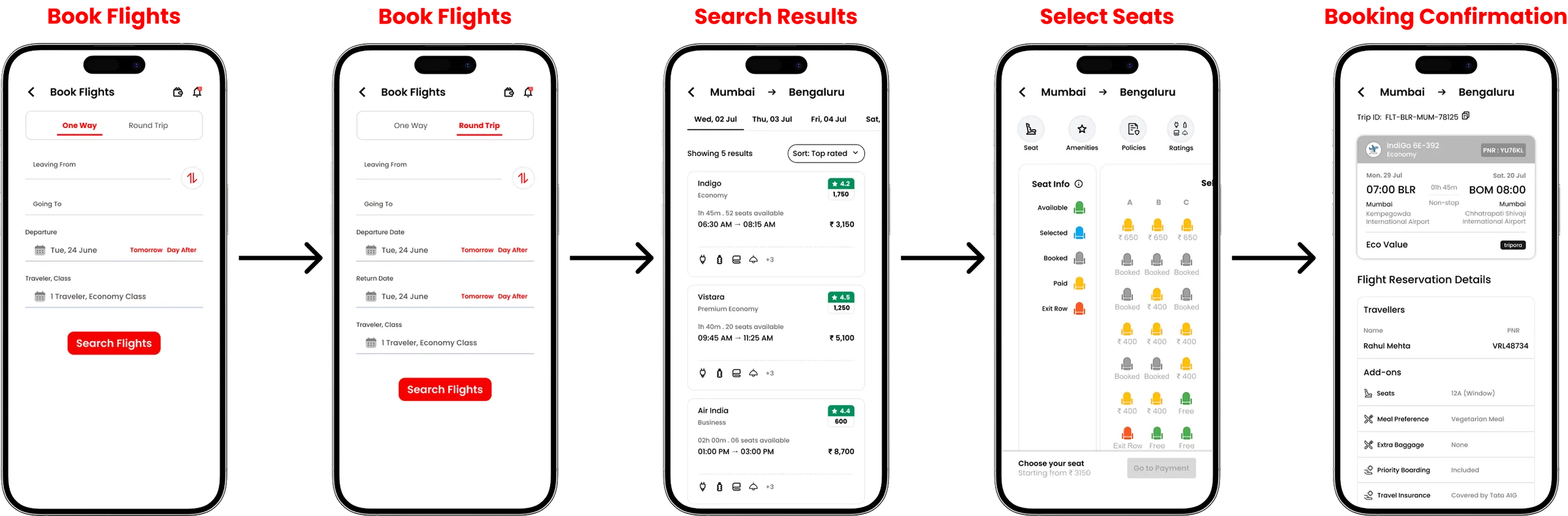
I mapped registration and home, then the booking flow end to end. In Book Flights a user picks one-way or return, then cities, travellers and class, then dates. Search results lead to seat selection, where the seat map is visual rather than a dropdown, and then straight to payment. The confirmation screen closes the loop with the finalised details in one place.
Wireframes to high-fidelity UI
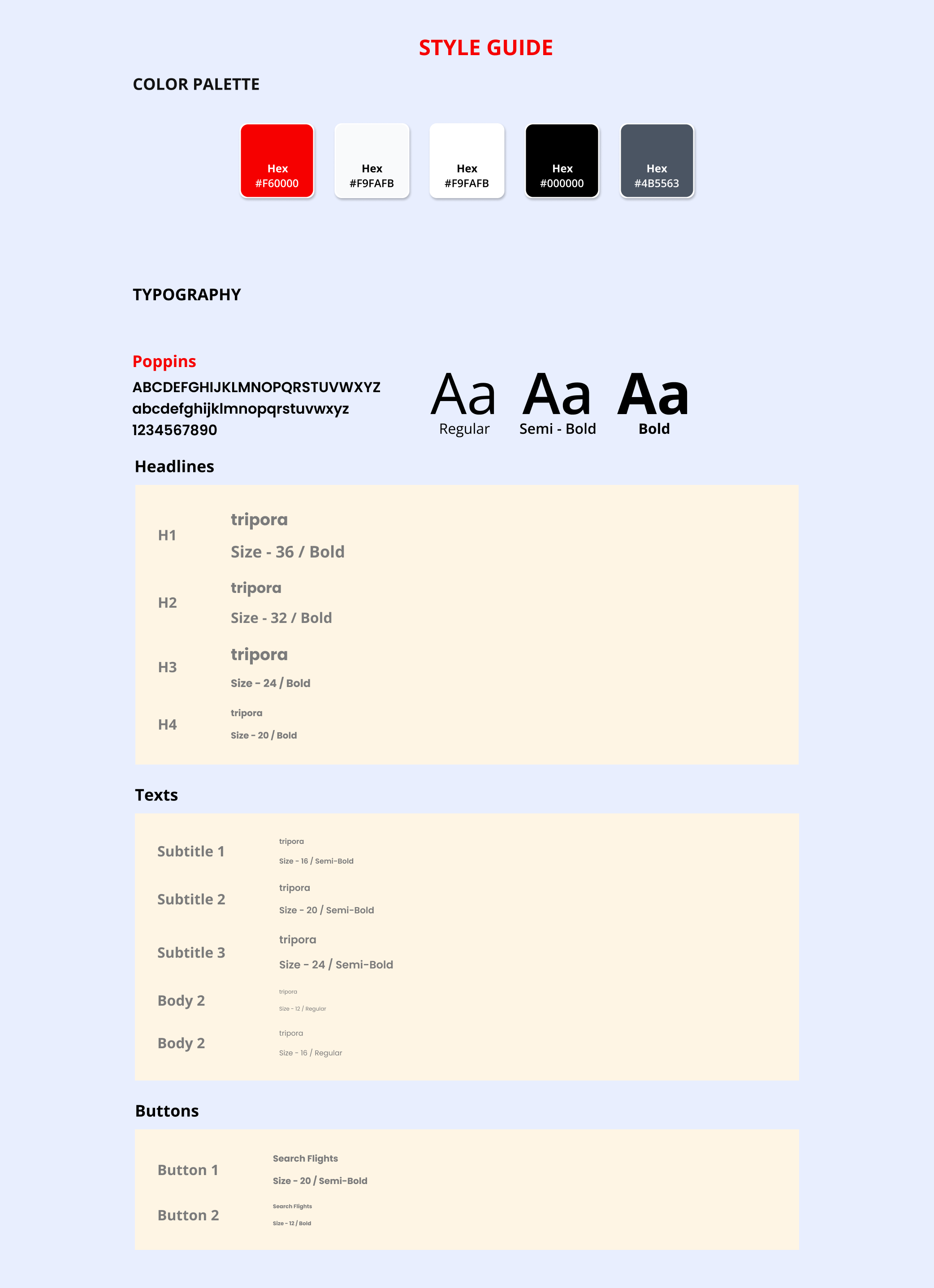
I started with digital low-fidelity wireframes, which let me iterate quickly and keep the layouts honest against real screen sizes. Once the structure felt right, I built them out in Figma with tripora's colour, typography and iconography, working from a style guide so the screens stayed consistent as the set grew.


Prototype and testing
The screens were wired into a clickable prototype and tested with users from different age groups, which is where the value of that wide audience showed: each group prioritised different things and hit different snags.
What's next
AI itineraries – Itinerary suggestions built on preferences and past trips.
Multimodal journeys – Flight, hotel, bus, train and tripora's own cab in one booking.
Real-time assistance – Chat-based trip updates and local tips.
Loyalty programmes – Integration with airlines, hotels and travel agencies.
Offline access – Itineraries available without a connection.
What I learned
Frame the problem before designing anything – Building from scratch gives you nothing to push against, and without a tight definition the feature list grows forever.
Feedback early beats a redesign later – The habit of testing while things were still rough saved me from rebuilding flows that looked fine on paper.
A design system pays for itself – Once the style guide existed, new screens took a fraction of the time and stayed consistent without effort.
Different users want different things – Testing across the age range surfaced priorities and stumbling blocks I would never have predicted from my own habits — and simple flows won adoption far more than extra features did.
Like what you see?
Let's talk about the role or project — I reply within 24 hours.