// Portfolio01 UI/UX Design
Profile Website Design
A from-scratch rebuild of my portfolio — one design system and one case-study template for UI/UX, 3D and graphic design, with pages that load a fraction of the weight.
- Discipline
- UI/UX Design
- Category
- Portfolio website
- Role
- Designer and builder
- Tools
- Figma, Astro, Pages CMS
Overview
My first portfolio site did its job — it put UI/UX, 3D and graphic design work online in one place. But as the work grew, it started to get in the way: projects sat below repeated banners, 3D pages downloaded every render at once, and every change meant editing code.
So I rebuilt it from scratch. Not a new coat of paint on the old pages, but a new structure, a design system and a single template that every project now follows.
What wasn't working
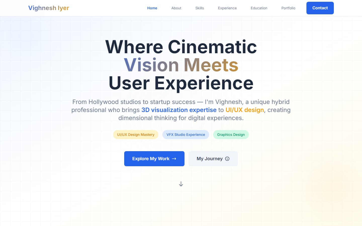
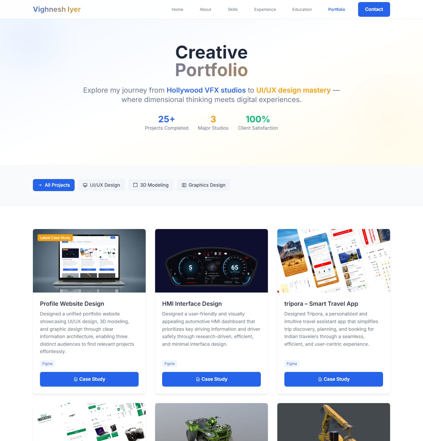
The work was buried – Every inner page opened with the same "Creative Portfolio" banner and stats before the project itself, so a visitor had to scroll just to see what they had clicked on.
Numbers that couldn't be backed up – The banner claimed "25+ projects", "3 major studios" and "100% client satisfaction". The first two were loose; the last one wasn't something I could stand behind.
Heavy 3D pages – Renders were stored as SVG files wrapping an image, 1–4 MB each, and a 3D page downloaded all of them the moment it opened — even though it showed one at a time.
Inconsistent details – Contact details differed between pages; some still carried placeholder text.
Hard to keep current – Every page was a separate HTML file, each case study laid out differently, and any update meant editing code. Newer work, like TradeRake, wasn't on it at all.
Before and after
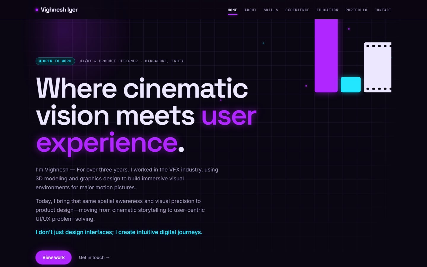
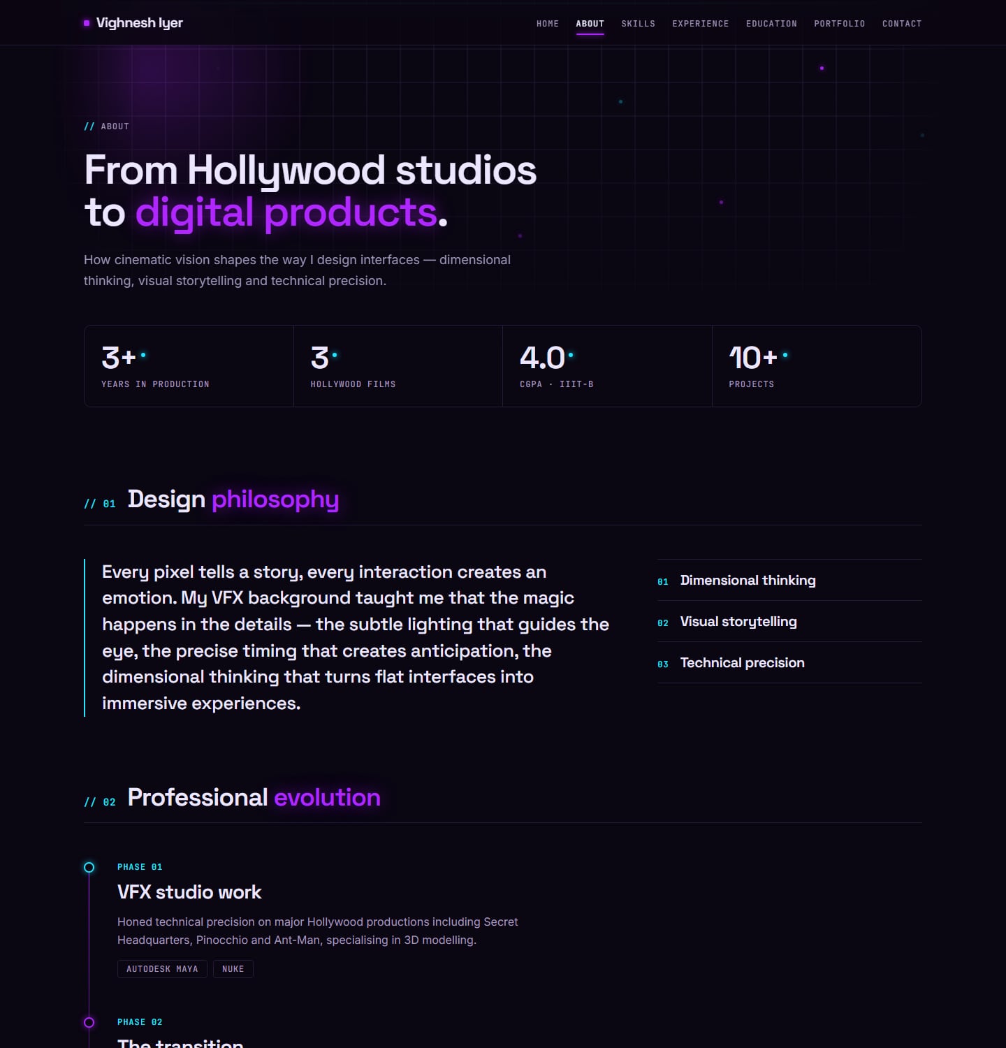
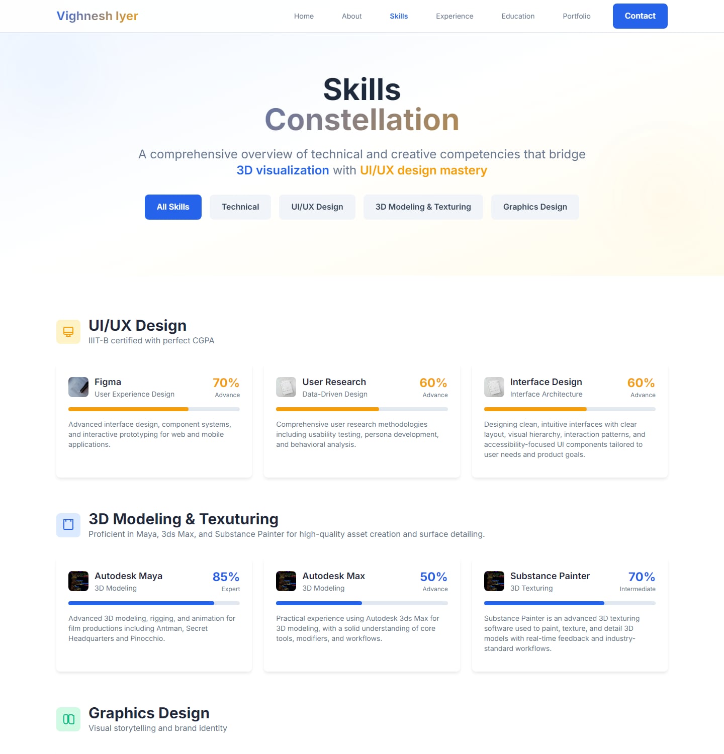
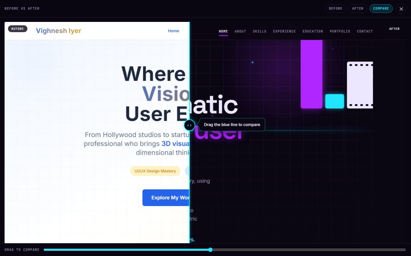
The same four pages on the old site and the new one.
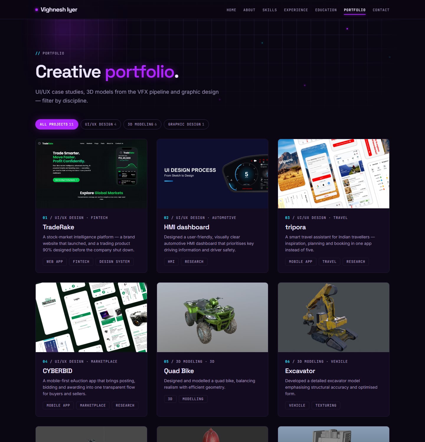
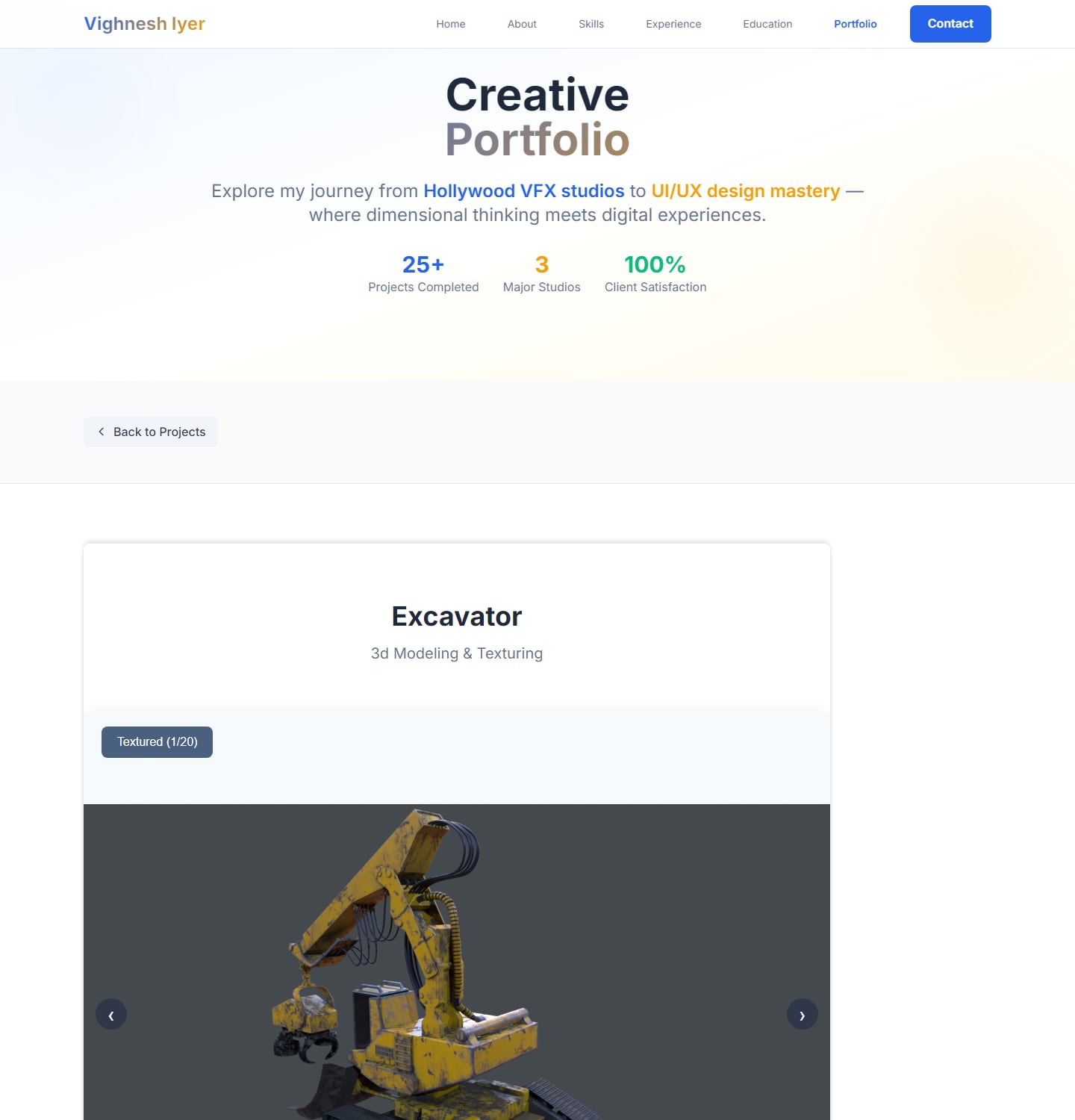
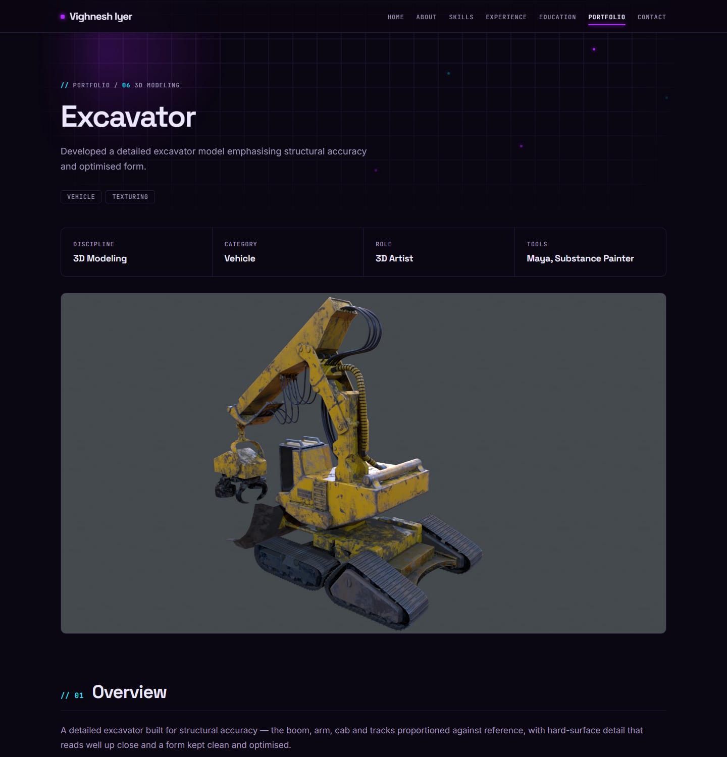
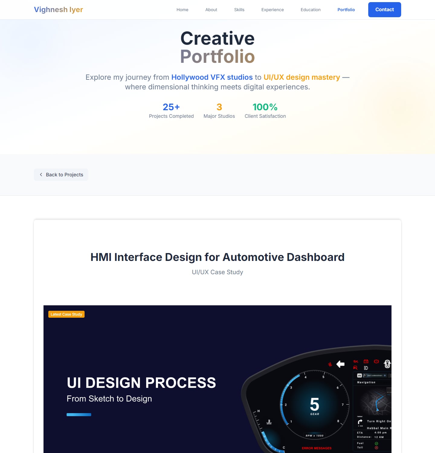
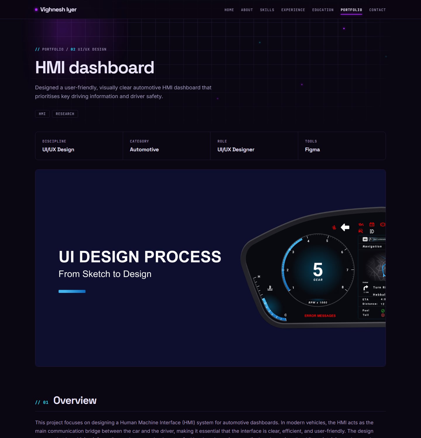
The rest of the site
The same treatment carried through every page, not just the portfolio.
About – The story stayed the same, but the page got tighter: the design philosophy and career evolution now read as two short sections instead of a long scroll beside a large illustration.
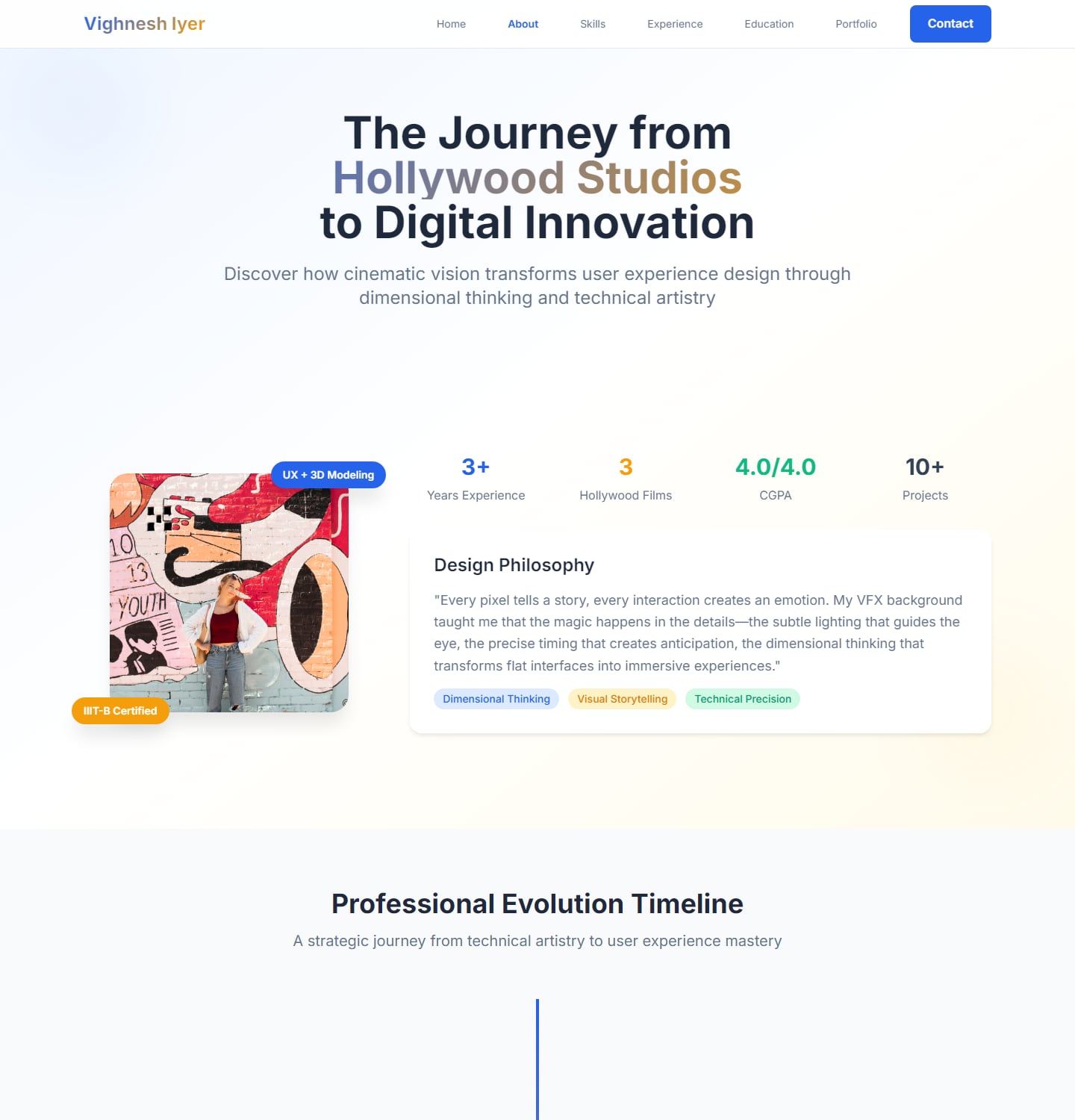
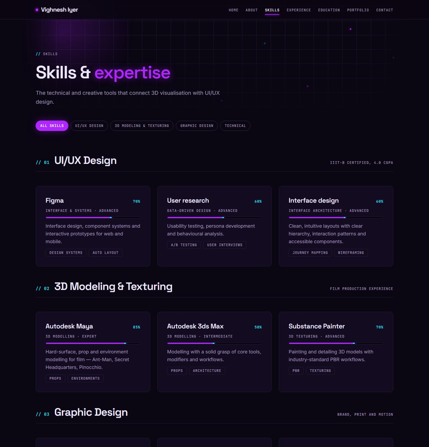
Skills – "Skills Constellation" became "Skills & expertise". The ratings and tools are the same, but each card now puts the tool, the level and what I use it for in one place, grouped by discipline.
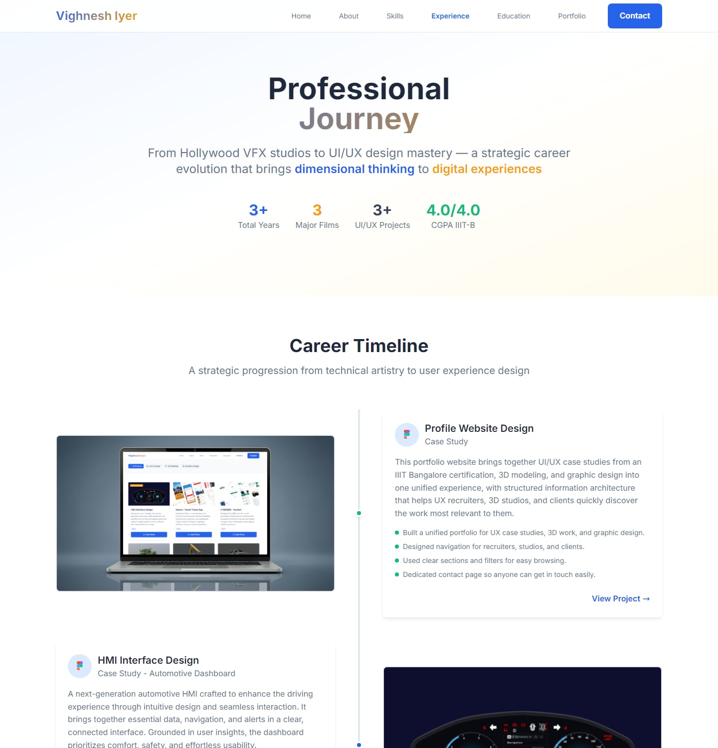
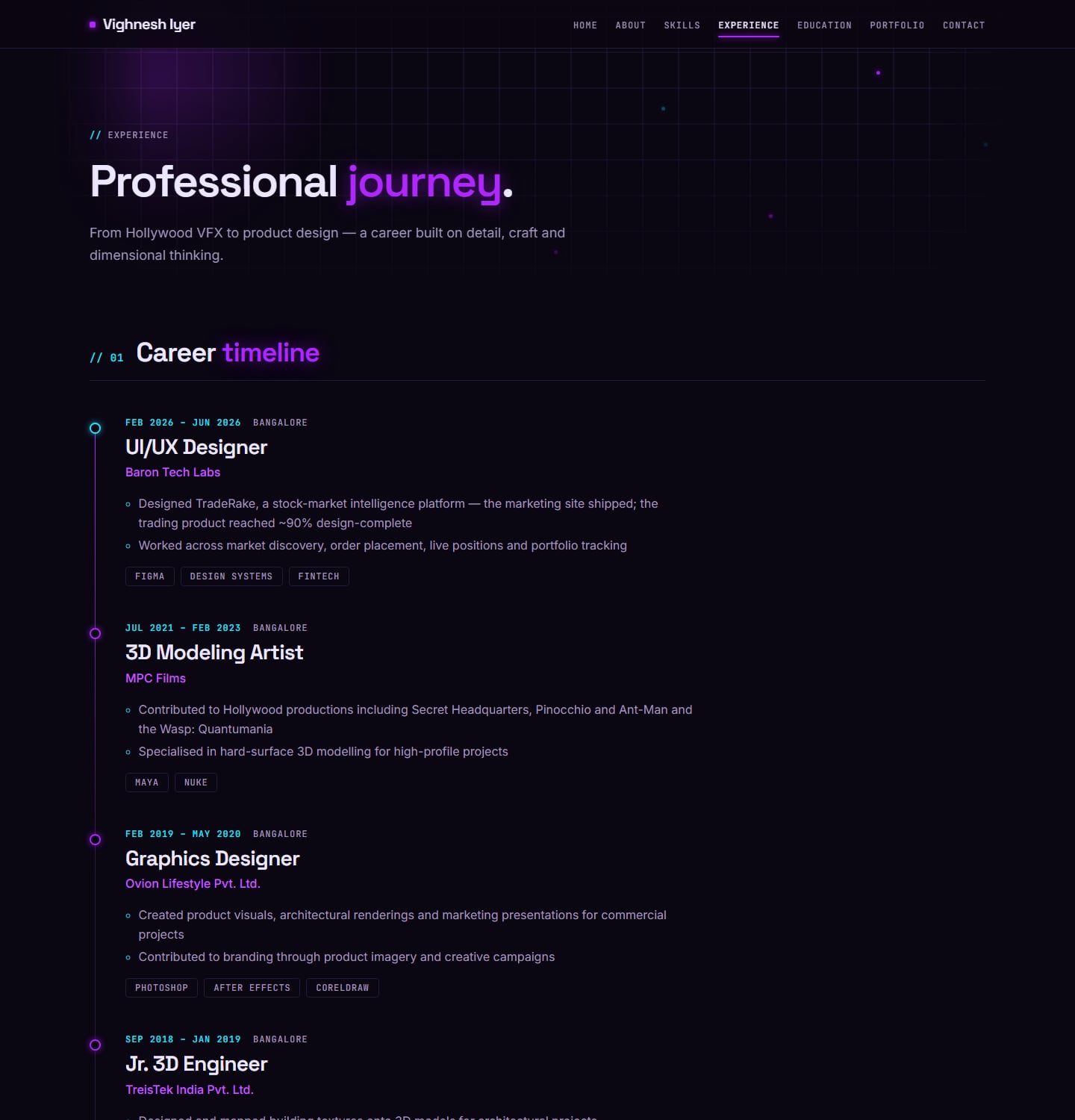
Experience – The old timeline listed projects — Profile Website, HMI, tripora — as if they were jobs, and my role at Baron Tech Labs was missing. The new timeline lists roles, employers and dates; the projects live in the portfolio.
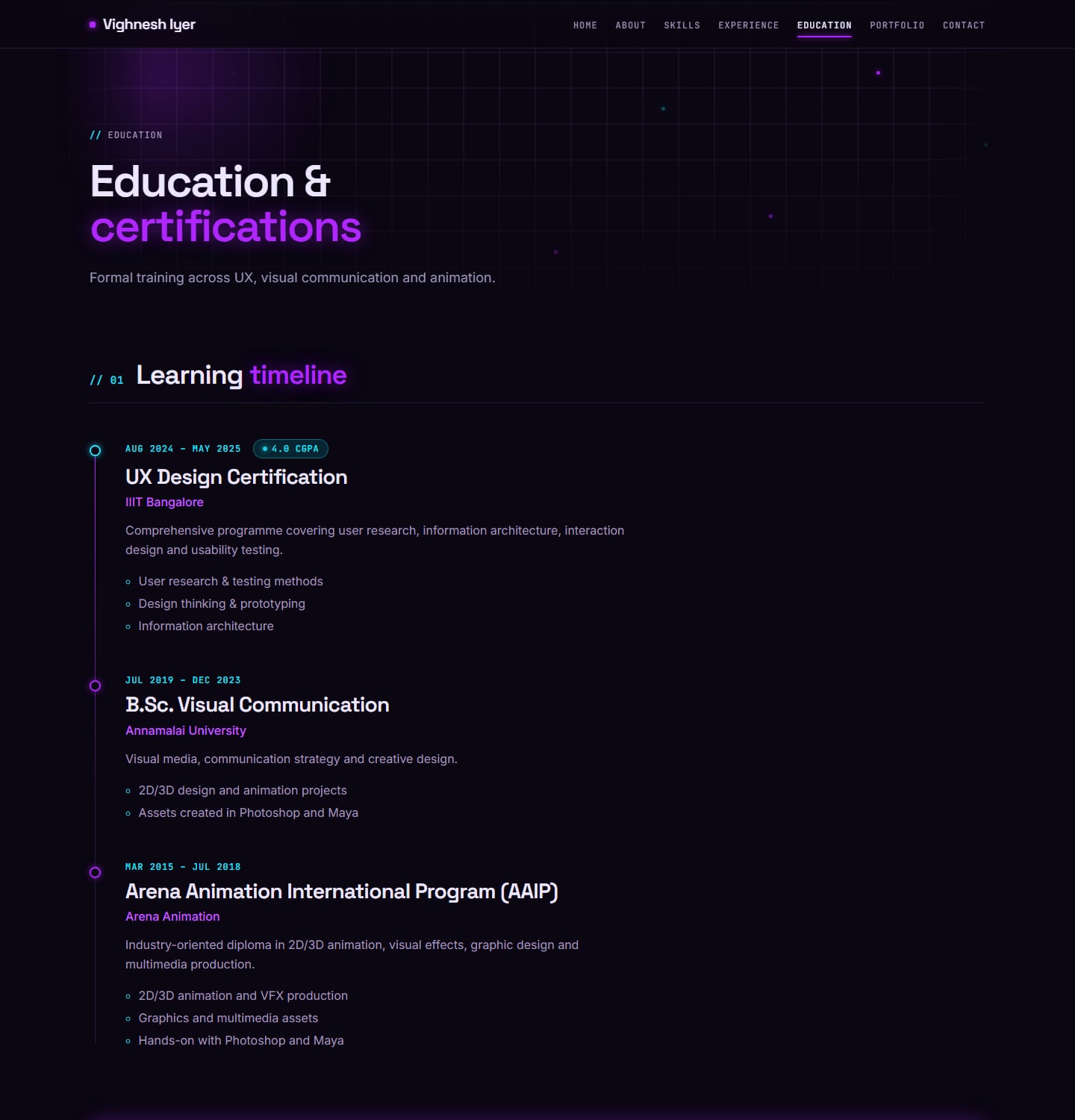
Education – The old page had a typo in its heading ("Educatioal Journey") and reused the Experience page's intro and stats. The new page is a single timeline: the IIIT-B certification, my B.Sc. and the Arena Animation programme.

Contact – The old form had 22 fields, with phone, project title and budget all required, and two cards both titled "Phone". The new page lists four clearly labelled ways to reach me, a shorter form where only name, email, topic and message are required — with "Full-time role" as an option for recruiters — and an FAQ.
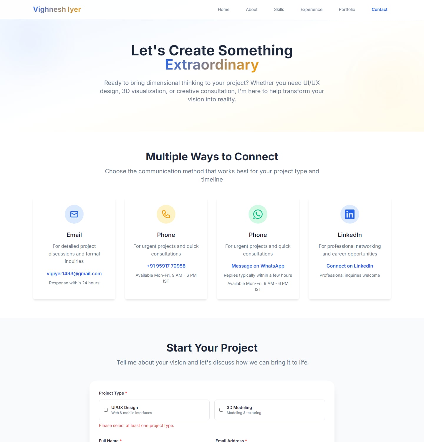
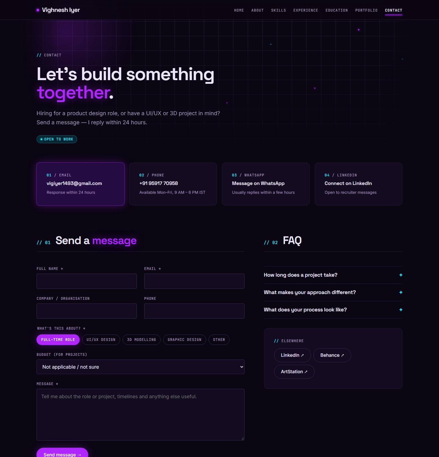
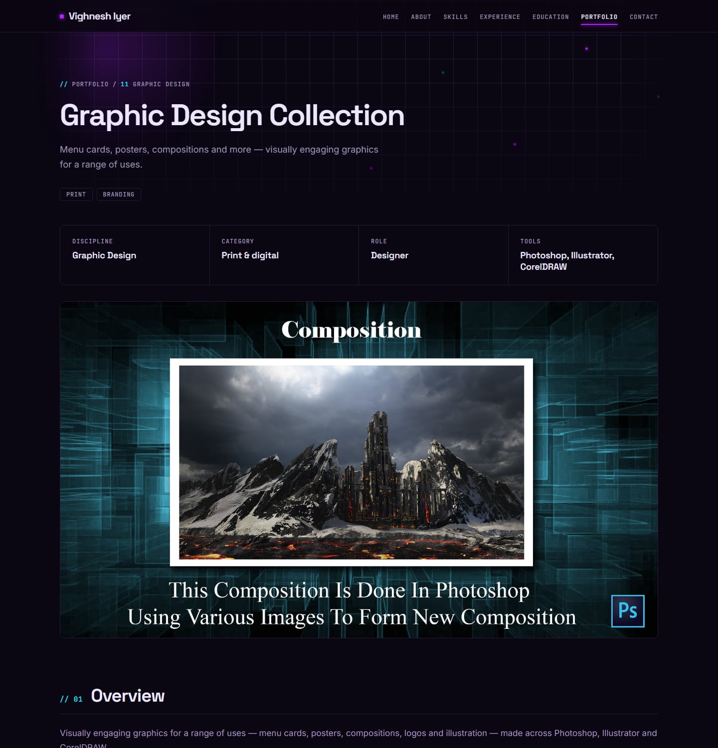
Graphic design – The old gallery sat below the same repeated banner as a slideshow. The new page uses the same viewer as the 3D projects, grouped by tool.
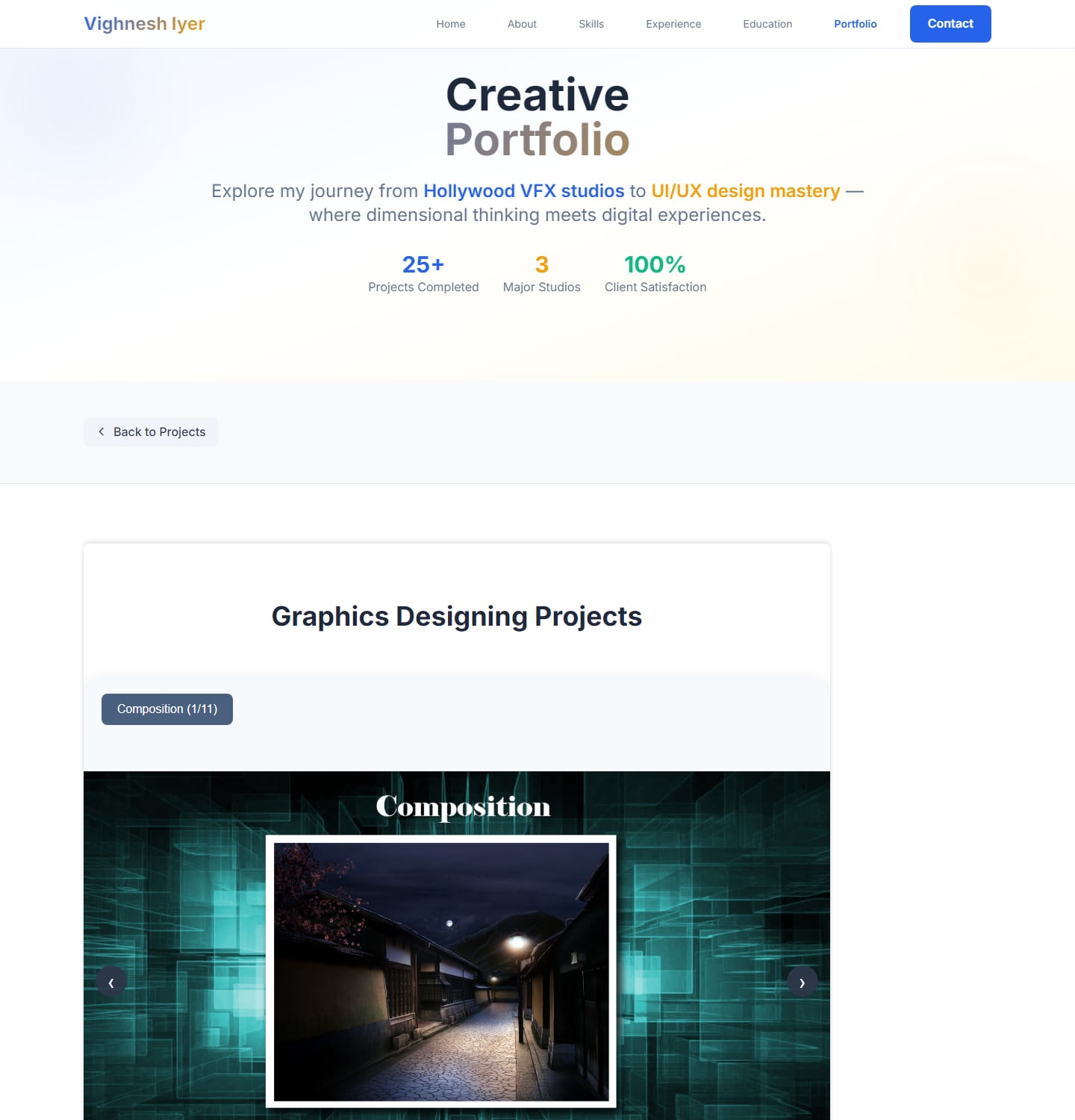
What changed
Work first – Each project page now opens with its title, a strip of key facts — discipline, category, role, tools — and the cover, then goes straight into the case study.
One template for everything – UI/UX case studies, 3D models and graphic design all use the same page, built from the same blocks, so every project reads the same way.
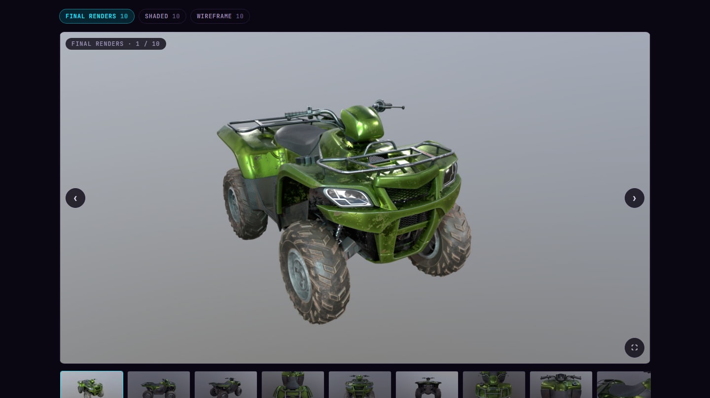
A render viewer for 3D – One large image with tabs for Final renders, Shaded and Wireframe, a thumbnail strip, arrows, keyboard and swipe, and full screen. Only the image in view downloads at full size.
Honest numbers – The stats on the home page are ones I can back up: years in production, films, my IIIT-B CGPA and the number of projects.
Built to maintain – Everything is now edited from the browser, and images take care of themselves — more on that below.
// Before → after
- 22.5 → 0.2 MB
- downloaded when the Excavator page opens
- 226 → 30 MB
- 3D render library, before the site compresses it further
- 12
- projects on one case-study template
- 0
- lines of code to publish an update
// How I rebuilt it
- 01
Audit
Went through every page of the old site as a visitor would, and listed what got in the way of the work.
- 02
Design system
One dark theme with colour, type and spacing tokens, and components shared by every page.
- 03
Templates
One case-study template built from blocks — text, images, steps, results and a render viewer for 3D work.
- 04
Content and speed
Moved editing into a CMS, converted every image, and made the build compress what I upload.
Design system
Everything on the site comes from one small system, so a new page or project looks right without being designed from scratch.
Colour – A dark, cinematic base with two accents: violet for actions and emphasis, cyan for status, focus and anything interactive. Fourteen colour tokens in total, plus two glows.
Type – Space Grotesk for display headings, Inter for reading, and JetBrains Mono for labels, numbering and metadata — the mono labels give every page the same technical, production-credits feel.
Spacing and shape – A 4-pixel spacing scale, three corner radii and a 1,200-pixel content width, with a faint 48-pixel grid behind each page header.
Components – Buttons, tags, filter chips, panels, stats and a timeline, shared by every page — and the set of case-study blocks that every project is built from, shown in the last tab.
Everything below is live — real colours, fonts and components, read straight from the stylesheet, so it can never drift out of date. The same system also has its own page.
#0a0612#130c20#06030b#240b42#251a38#3a2b55#ece6ff#a397bd#6c5f86#b026ff#c45cff#22093d#22e6ff#0625304px8px12px16px24px32px48px64px96px128px4px10px999px1200px wide, reading column 680px, gutters 48px (16px on phones), and a 48px grid behind every page header.- Stat
- 3+
- With a cyan dot
- 4.0
- Mono label
- 10+
- Hairline grid
- 12
Under the hood
A portfolio only stays current if updating it is easy, so the parts nobody sees got as much attention as the pages.
A CMS instead of code – Every page is edited in Pages CMS from the browser. Case studies are built from blocks — text, images, before / after comparisons, galleries, a 3D render viewer, process steps, results and callouts — and each block is placed in the write-up with a simple marker.
// From edit to live
- 01
Edit
Change text or upload images in Pages CMS, from the browser.
- 02
Save
Every save is committed to GitHub automatically.
- 03
Build
The site rebuilds — images are checked, compressed and given thumbnails.
- 04
Live
The update is on the site about a minute later.
Media libraries – Uploads, 3D renders and graphic design each have their own library, with a folder per 3D project.
Automatic image optimisation – Every time the site publishes, large images are resized and converted to WebP, and the 3D viewer gets small thumbnails. The heaviest images on the site — 38.9 MB of them — are served as 10.8 MB.
An upload guard – The CMS can't limit file size, so the build does: anything over 5 MB stops the publish and names the file, and every image field says what size to aim for.
The stack – Astro builds a fast static site, Pages CMS edits it through GitHub, GitHub Actions rebuilds on every save and GitHub Pages hosts it — no server or database to look after.
Migrating the old work – The old site stored every render and graphic as an SVG file wrapping a picture. A small script pulled the picture out of each one and saved it as a JPG — 139 images, from 250 MB to 33 MB — so nothing had to be re-exported by hand.
Click to view, drag to compare – Any case-study image opens full size, and before / after pairs open with Before, After and Compare views — like the ones on this page. Comparisons are their own block in the CMS, so any future project can use them.
A viewer for 3D work – One large render with tabs for the final, shaded and wireframe passes, a thumbnail strip, keyboard and swipe, and full screen.
What I learned
Audit your own work like a stranger would – Clicking through the old site as a recruiter would made the problems obvious in minutes; I had stopped seeing them as the author.
Performance is part of the design – A 3D page that downloads 22 MB before showing anything is a design problem, not just a technical one. Fixing how images load changed the experience more than any visual change.
A system beats a collection of pages – Once the template and blocks existed, adding a new project became a content task rather than a design task.
Design for the person who maintains it – That person is me. A site I can update in minutes is a site that stays current.
Like what you see?
Let's talk about the role or project — I reply within 24 hours.