// Portfolio02 UI/UX Design
TradeRake
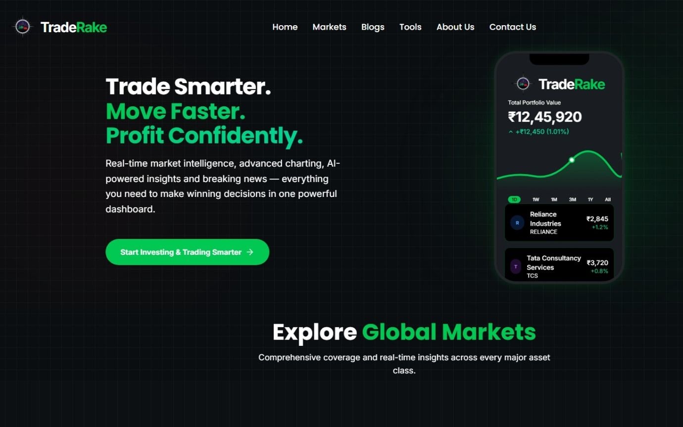
A stock-market intelligence platform — a brand website that launched, and a trading product 90% designed before the company shut down.
- Discipline
- UI/UX Design
- Category
- Fintech
- Role
- UI/UX Designer, Baron Tech Labs
- Tools
- Figma, Prototyping, Design system
Overview
Picture an investor deciding where to put their money. The usual routine is five different apps for prices, news and calculators, plus a stock tip in their inbox that leaves them second-guessing every decision.
Active traders have the same problem at a faster pace: data scattered across tools, insights that arrive late, and not enough clarity for decisions that carry real money.
TradeRake is a stock-market intelligence platform built to fix that — one place where investors get real-time market intelligence, traders get actionable insight, and everyone gets a clear, transparent view of the market.
I designed it at Baron Tech Labs: the brand and marketing website first, then the product behind it. The company closed abruptly, and the site is now reduced to a single branding page — so the screens in this case study come from screenshots I saved while it was up. The site also had About us and Contact us pages, but it went down before I could capture them, so they are not shown here.
Project timeline
// Two phases
- 01
Phase 1 — Brand website
Designed and developed — Home, Markets, Blogs and Tools pages, CMS-driven. Launched, then taken offline when the company closed.
- 02
Phase 2 — The product
About 90% designed — Markets, authentication, profile, settings and the post-login home.
- 03
Shut down
The company closed abruptly over funding. Phase 2 never shipped, and the site is now just a branding page.
Phase 2 started from competitive research into how India's leading platforms — ICICI Direct, Tickertape, Groww and Zerodha — handle market discovery, onboarding and the logged-in experience, and what they leave hard for a newer investor.
Home page
The home page had one job: explain what TradeRake is, prove it covers the whole market, and earn an early-access sign-up from a product that had not launched yet. Each section was built to carry the visitor one step further toward that ask.
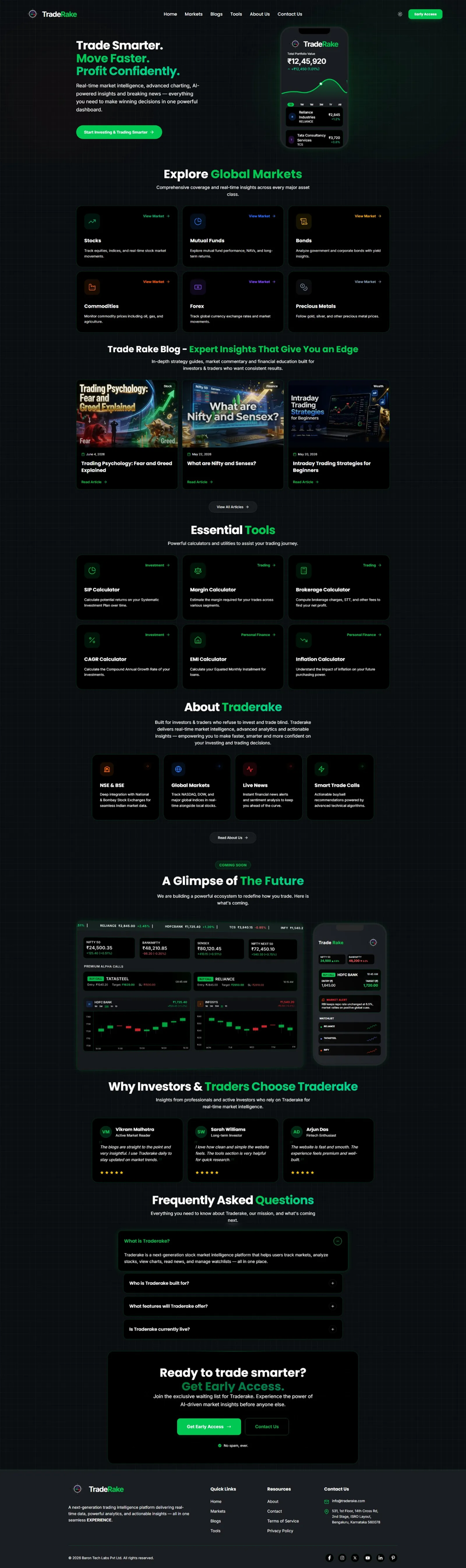
Hero – A clear value proposition next to a live app preview — portfolio value and watchlist — so the product is shown working, not just described.
Explore global markets – Six asset-class cards — stocks, mutual funds, bonds, commodities, forex and precious metals — in a scannable grid that shows full market coverage at a glance.
Essential tools – Six calculators (SIP, margin, brokerage, CAGR, EMI, inflation) that solve a real annoyance: people juggling separate calculator apps for their financial planning.
Blog – Articles on trading psychology, market basics and strategy, positioning TradeRake as somewhere to learn, not only a data tool.
About TradeRake – Four trust pillars — NSE and BSE integration, global markets, live news and smart trade calls — that separate it from a generic tracker.
A glimpse of the future – A teaser dashboard that previews the in-app experience and builds anticipation for early access.
Testimonials and FAQ – Short reviews from investor and trader personas for social proof, then plain answers to what TradeRake is and where it stands — both placed right before the sign-up to remove the last hesitation.
Get early access – The page closes on a clear, low-commitment action that fits a pre-launch product.
Markets page
Six asset classes behave very differently and attract different people, so each one gets its own row, with alternating text and mockup placement and a distinct accent colour. The rhythm keeps the page scannable; the colour tells the markets apart.
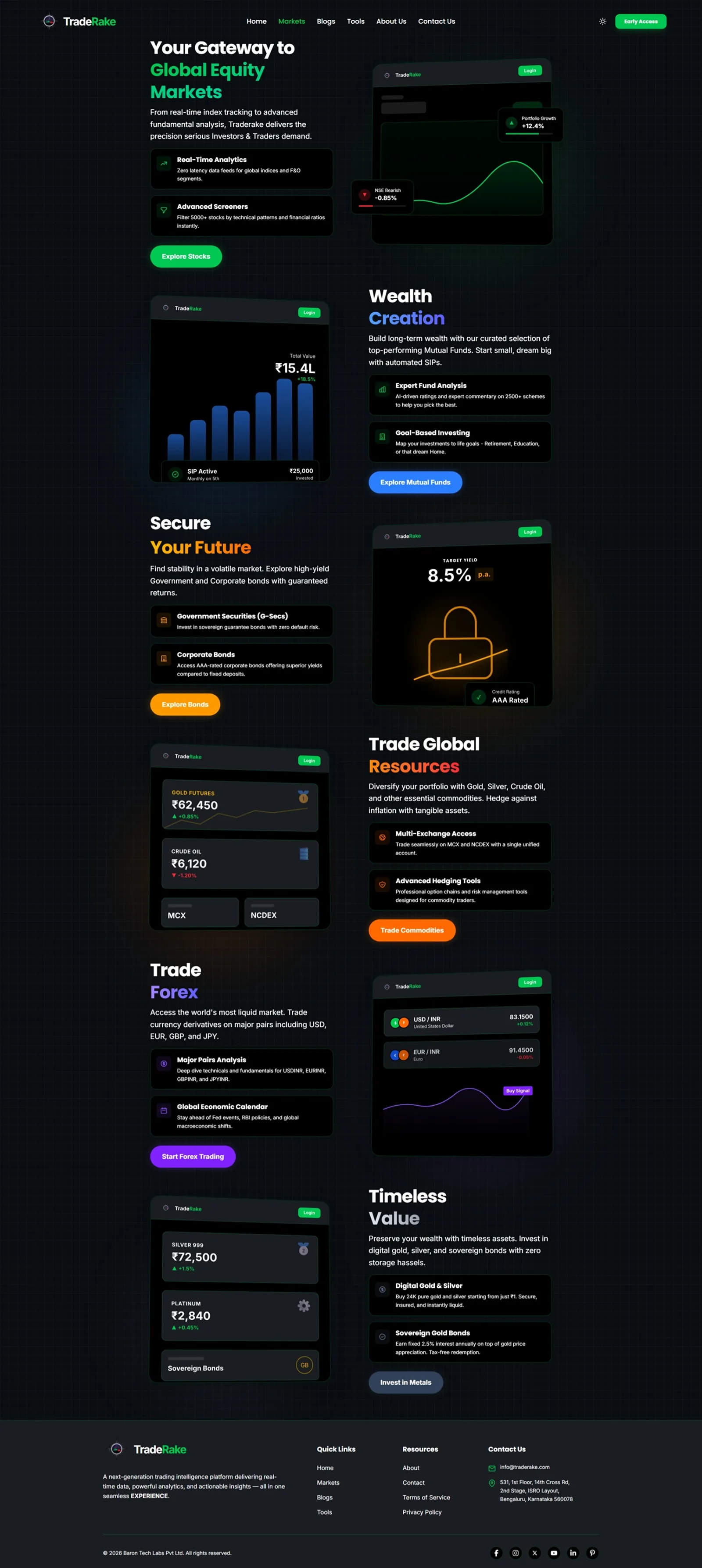
Global equity markets – Real-time analytics and stock screeners, with a portfolio-growth mockup that shows data depth for serious traders.
Wealth creation (mutual funds) – Long-term, goal-based investing and SIPs, backed by a fund-analysis preview and a rising SIP value chart.
Secure your future (bonds) – Framed as the stable option, with a lock visual and an AAA credit rating to build trust.
Trade global resources (commodities) – Positioned as an inflation hedge, with live gold and crude prices across MCX and NCDEX.
Trade forex – Major currency pairs and a live buy signal for active, technically driven traders.
Timeless value (metals) – Digital gold, silver and sovereign gold bonds as a low-hassle way to hold precious metals.
Blogs and tools
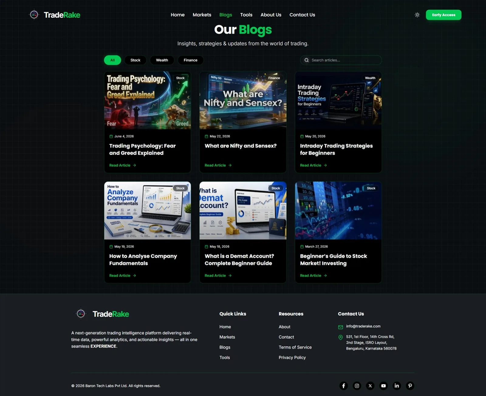
Both libraries were designed to grow, so they share one pattern: category tabs and search to jump straight to what you need, and a consistent card that makes a long list easy to scan.
Blogs – Tabs for All, Stock, Wealth and Finance. Each card carries a category tag, date, title and "Read article". The mix — psychology, beginner basics, market fundamentals — supports readers at every stage of their investing journey.
Tools – Tabs for Investment, Trading and Personal Finance. Each card has a category tag, icon, name and a one-line description, so a wide range of calculators can be compared at a glance.
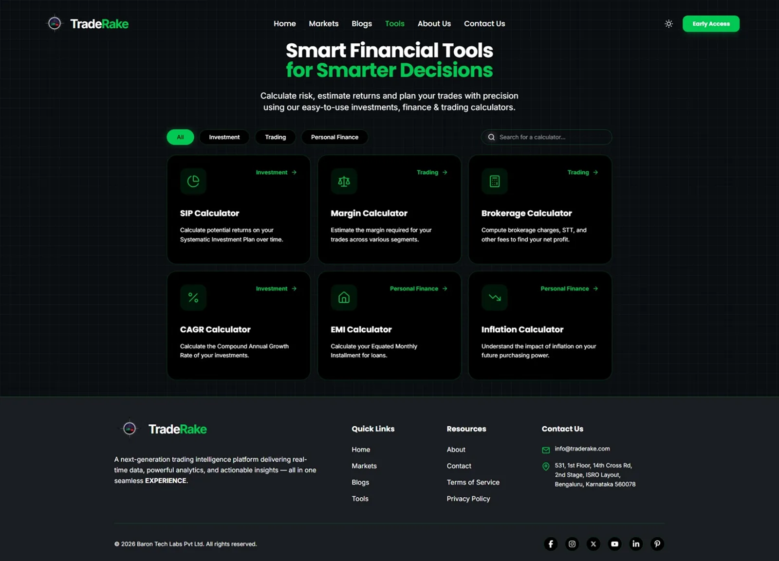
CMS-driven – Articles and calculators are both managed through a CMS, so the team could publish a new article or add a new tool without design or development support.
What I learned
Design for the stage the product is at – A pre-launch site cannot sell features people cannot use yet. Showing the product working, then asking for a small commitment, did more than a long feature list would have.
Structure is what makes dense data readable – One repeated pattern with a distinct accent per market let six very different asset classes sit on one page without blurring together.
Build for the team, not just the launch – Making blogs and tools CMS-driven meant the team could keep the site growing without waiting on design or development.
Projects can end without warning – Phase 2 was 90% designed when the company closed, and the site went down with it. Saving screenshots and documenting as I went is the only reason this work can still be shown.
Like what you see?
Let's talk about the role or project — I reply within 24 hours.